Halloween is coming..!
Halloween is just around the corner, I am still trying to decide which candies to purchase this year for trick-or-treaters.
Initially I was looking for data sets maybe comparing American chocolate bars vs Canadian chocolate bars possibly with sugar contents or lists of ingredients. I am really curious why there are big differences in candy between Canada and US, but for now I couldn’t find them instead I came across below data sets.
Data itself is actually bit outdated, since it’s data from candy sales in 2007-2015. I’m not even sure if these popular candies changes every year or not. Now I’m curious to find data sets that are more recent…
CandyStore.com’s sales from 2007–2015—focusing on the three months leading up to Halloween
Since data set contains data at state level for US, I decided I’ll practice plotting the data on grid map, I’ve been wanting to try. To colour the map, I’ve decided instead of colouring by volume of candy purchased (in pounds), I’ve gathered population by state in order to figure out ratio of candy per person.
Looks like Hawaiian eats lots of Hershey Kisses (or in general, maybe there are more sweet tooth in Hawaii!). Utah, Nevada and Arizona also seems to maybe either consumer more sweets or possibly top ranked chocolates are purchased in volume!
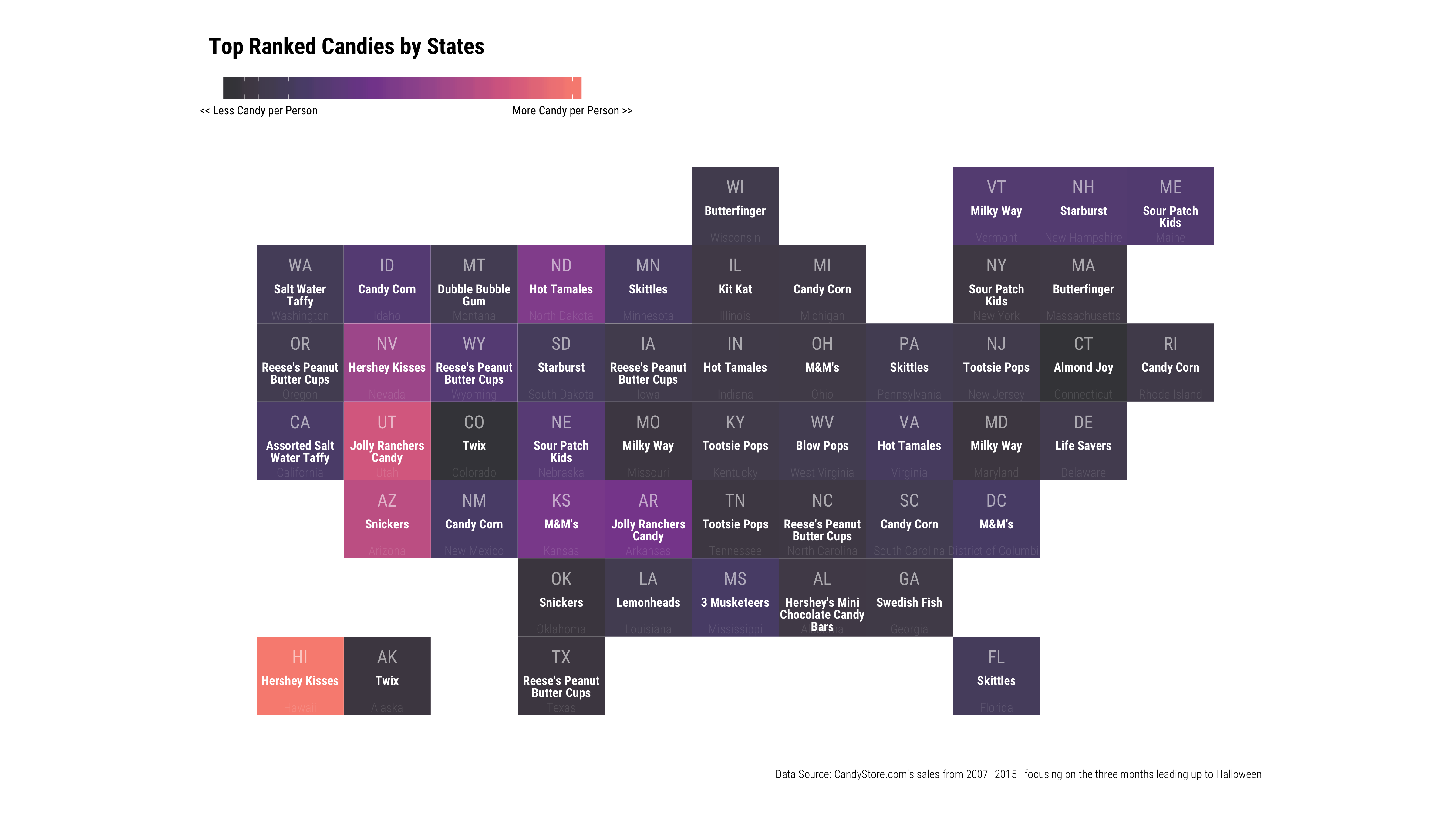
It would’ve been fun to gather all candy images and place them in the grid too…!
Below are the steps I took to visualize the data.
Importing Data & Tidying Up
I’ve imported data to dataframe using jsonlite package using fromJSON function from OpenDataSoft site. There seems to be lots of other interesting data sets!
I’ve also harvested population by state from Wikipedia using rvest package.
library(tidyverse) ## basically tidyverse is needed for everything :)
library(jsonlite) ## to read data in json format
library(rvest) ## to scrape website
library(hrbrthemes) ## I love this themes!
## read this: https://cran.r-project.org/web/packages/hrbrthemes/vignettes/why_hrbrthemes.html
library(geofacet)  ## I'll use the grid in this package to create
library(ggrepel) ## so that texts on ggplot don't overlap!
library(janitor) ##  My recent favourite

## Download Candy Data from Opendata Soft site.
candy_data <- jsonlite::fromJSON("https://public.opendatasoft.com/api/records/1.0/search/?rows=51&start=0&fields=name,top_candy,top_candy_pounds,2nd_place,2nd_place_pounds,3rd_place,3rd_place_pounds&dataset=state-by-state-favorite-halloween-candy&timezone=America%2FLos_Angeles")


## I'll call this candy_wide, because data is in wide format.
candy_wide <-candy_data$records$fields
names(candy_wide) <- c("state","rank_3","pound_2","rank_2","pound_3","rank_1","pound_1")


## Might be interesting to see Volume per Capita, so get population data from Wiki.
state_pop_html <-
  read_html("https://simple.wikipedia.org/wiki/List_of_U.S._states_by_population") %>%
  html_table(2)
state_pop_html <- state_pop_html[[2]]

## I'm only really interested in population, so trim down the table bit.
state_pop <- state_pop_html %>% select(state=3, pop_2016=4)

## I want population to be numeric value instead of character
state_pop <- state_pop %>% mutate(pop_2016 = as.numeric(str_remove_all(pop_2016,",")))
Transforming Data from Wide to Long format
### Data Transformaiton (Wide to Long)

## Data is in wide format, nicer to look at but I want to convert it to long format!
candy_rank_long <- candy_wide %>%
  select(state, rank_1, rank_2, rank_3) %>%
  gather(ranking, chocolate, -state) %>%
  mutate(ranking = as.integer(str_remove(ranking,"rank_")))

candy_pound_long <- candy_wide %>%
  select(state, pound_1, pound_2, pound_3) %>%
  gather(ranking, volume, -state) %>%
  mutate(ranking = as.integer(str_remove(ranking,"pound_")))

candy_long <- candy_rank_long %>%
  inner_join(candy_pound_long) %>%
  left_join(state_pop)

candy_long <-candy_long %>% mutate(volume_per_capita = volume/pop_2016)

## Just creating state table
state_df <- tibble(
  state = c(state.name,"District of Columbia"),
  state_div = c(as.character(state.division),"South Atlantic"),
  state_abb = c(state.abb, "DC")
)

candy_long <- candy_long %>%
  left_join(state_df)
Overall Popular Candies in United States
If candy was ranked #1 in state, I gave gold colour, if #2, then silver, #3 then bronze. Sort of like Olympic, I’ve counted how many metals each candies have gotten to decide most popular candy in US.
There were total of 27 different candies in this data sets, most popular candies are M&M followed by Skittles! I thought it was also interesting that Life Savers were top ranked candy in Delaware, but it did not appear in any other state, and similarly for Swedish Fish in Georgia.
There’s Assorted Salt Water Taffy and Salt Water Taffy… I wasn’t sure if they are same candies…!
## using janitor package
candy_list <- candy_long %>% tabyl(chocolate, ranking)  %>%
  adorn_totals("col") %>%
  arrange(-Total,-`1`,-`2`,-`3`) ## if candy was listed same # of times, then I want to make sure that better ranked candies are ranked higher.

#show_col(c("#A77044", "#A7A7AD","#D6AF36")) # bronze, silber, gold

candy_long  %>%
  mutate(chocolate = fct_relevel(chocolate, candy_list$chocolate)) %>%
  count(chocolate, ranking, state, state_abb) %>%
  ggplot(aes(x=fct_rev(chocolate),y=n)) +
  geom_col(aes(fill=fct_rev((factor(ranking)))), colour="#ffffff30") +
  geom_text(aes(label=state_abb), position="stack", colour="#ffffff",
            size=5, hjust=1, family=font_rc, fontface="bold") +
  theme_ipsum_rc() +
  coord_flip() +
  scale_fill_manual(values=c("#A77044", "#A7A7AD","#D6AF36"),
                    name="ranking within state",
                    labels=c("bronze (3rd)", "silver (2nd)","gold (1st)")) +
  scale_y_comma() +
  labs(title="Halloween Candy Olympic! - which candy gets which ranking from which state?") +
  theme(legend.position="top", legend.direction = "horizontal") +
guides(fill = guide_legend(reverse = TRUE)) 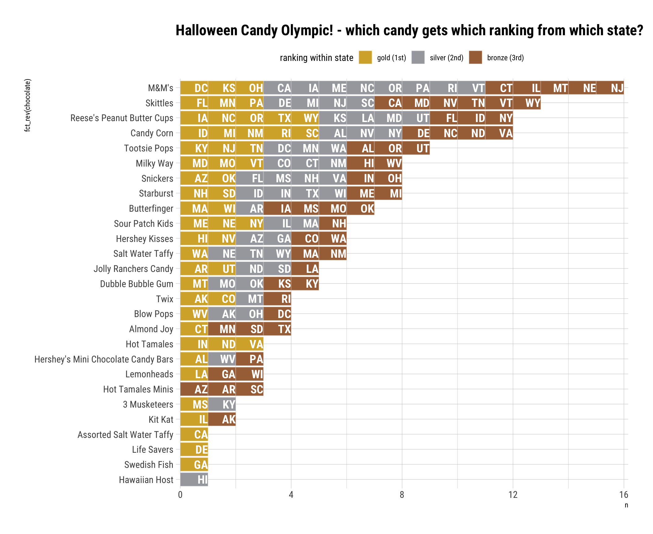
Grid State Map
I recently discovered geofacet package. Examples of graphs you can create with this package looks super fun! I thought it was really neat that I can create my own grid using “Geo Grid Designer”!!
#get_grid_names() --> you can see what grids are available.
## I can preview the grid first
#grid_design(us_state_grid1)

## Going to use US state map  grid in geofacet package
head(us_state_grid1) %>% knitr::kable()| row | col | code | name |
|---|---|---|---|
| 6 | 7 | AL | Alabama |
| 7 | 2 | AK | Alaska |
| 5 | 2 | AZ | Arizona |
| 5 | 5 | AR | Arkansas |
| 4 | 1 | CA | California |
| 4 | 3 | CO | Colorado |
## Join Candy data & grid so I can create grid map
candy_long_with_coord <-
  candy_long %>%
  left_join(us_state_grid1, by=c("state_abb" = "code"))

## Replace every other space with new line
## some chocolate names are little too long to lists in one line...
space_to_newline = function(x) gsub("([^ ]+ [^ ]+) ","\\1\n", x)
candy_long_with_coord <- candy_long_with_coord %>%
  mutate(chocolate_label = map_chr(chocolate, space_to_newline),
         facet_label = case_when(ranking==1 ~ "Top Ranked Candies by State",
                                 ranking==2 ~ "2nd Popular Candies by States",
                                 ranking==3 ~ "3rd Popular Candies by States"))


candy_long_with_coord %>%
  #filter(ranking==1) %>%
  ggplot(aes(x=col, y=row)) +
  geom_tile(color="#ffffff90", aes(fill=volume_per_capita)) +
  #geom_text(aes(label=state), size=3.5, color="#ffffff20", vjust=4, family=font_rc_light) +
  geom_text(aes(label=state_abb),size=5, family=font_rc, vjust=-1, color="#ffffff90") +
  geom_text(aes(label=chocolate_label), family=font_rc, size=3.5, lineheight=0.8, color="#ffffff", vjust=1, fontface="bold") +
  scale_y_reverse(breaks=NULL) +
  scale_x_continuous(breaks=NULL) +
  theme_ipsum_rc(base_family="Roboto Condensed") +
  scale_fill_viridis_c(option="magma", alpha=0.8, end=0.7,
                       name="",
                       breaks=fivenum(candy_long$volume_per_capita),
                       labels=c("","","<< Less Candy per Person","","More Candy per Person >>")) +
  facet_wrap(~fct_reorder(facet_label, ranking), ncol=1) +
  theme(legend.position = "top",
        legend.key.width = unit(2, "cm"),
        legend.justification = "left") +
  labs(title="Top Ranked Candies by States",
       caption="Data Source: CandyStore.com's sales from 2007–2015—focusing on the three months leading up to Halloween", x="", y="") +
  coord_fixed(ratio=0.9)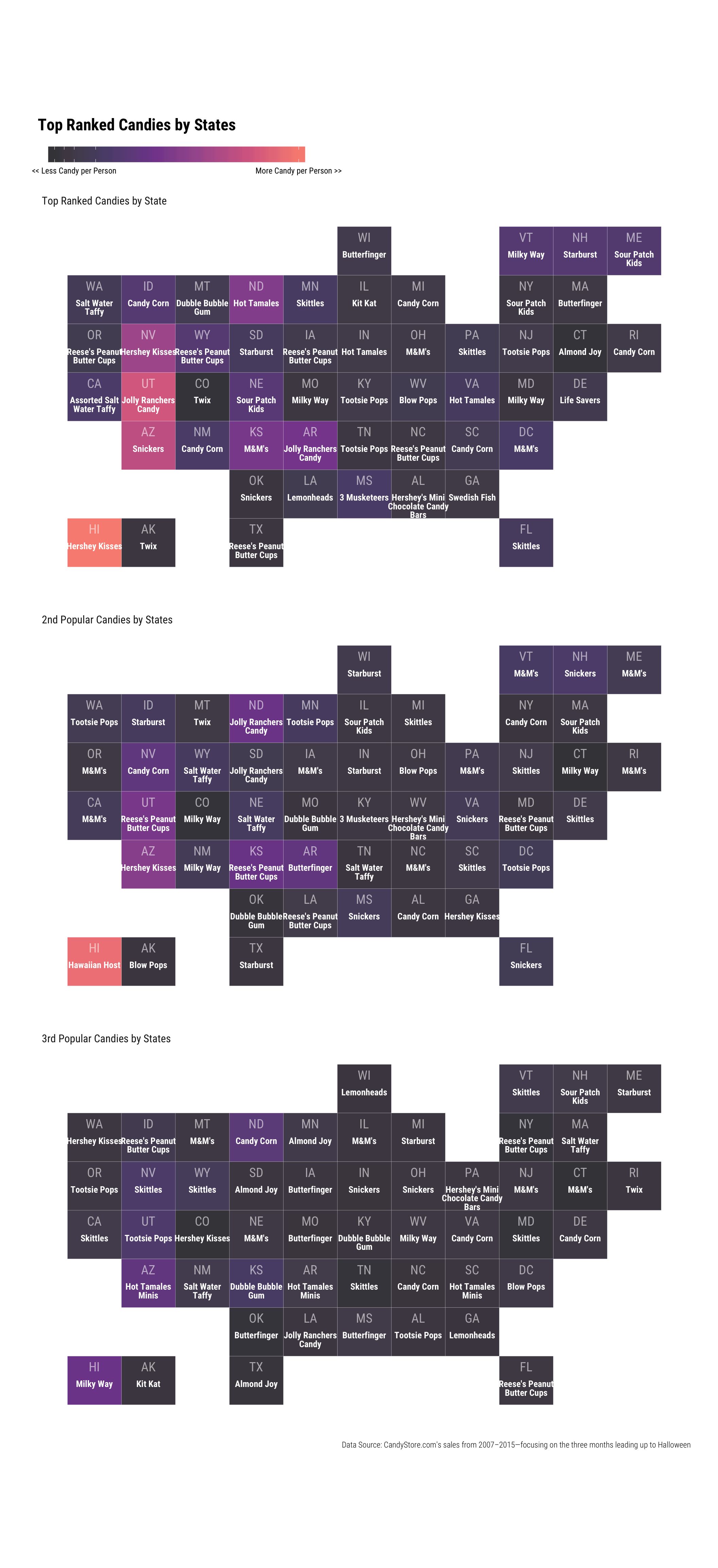
Share this post
Twitter
Google+
Facebook
Reddit
LinkedIn
Pinterest
Email